We designed a visual identity for
Abhay Mohan
Branding
CREATIVE STRATEGY
How we did what we did.
Crafting a distinct brand identity for Abhay Mohan, capturing his rising journey in the competitive Indian Motorsports scene.

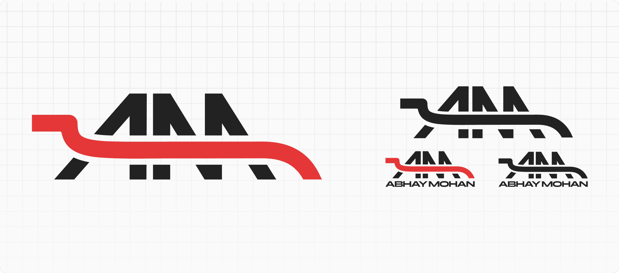
The logo for Abhay Mohan is a study in bold simplicity, embodying his spirit as a motorsport competitor. The interlocking "A" and "M" stand firm in black, a nod to the driver's determination and unwavering focus.
Slicing through the letterforms is a sweeping red
curve, reminiscent of a racecar's dynamic lines and the visceral curves of a racetrack
This visual assertion of identity is a declaration of the brand's commitment to excellence and resilience in the face of competition.
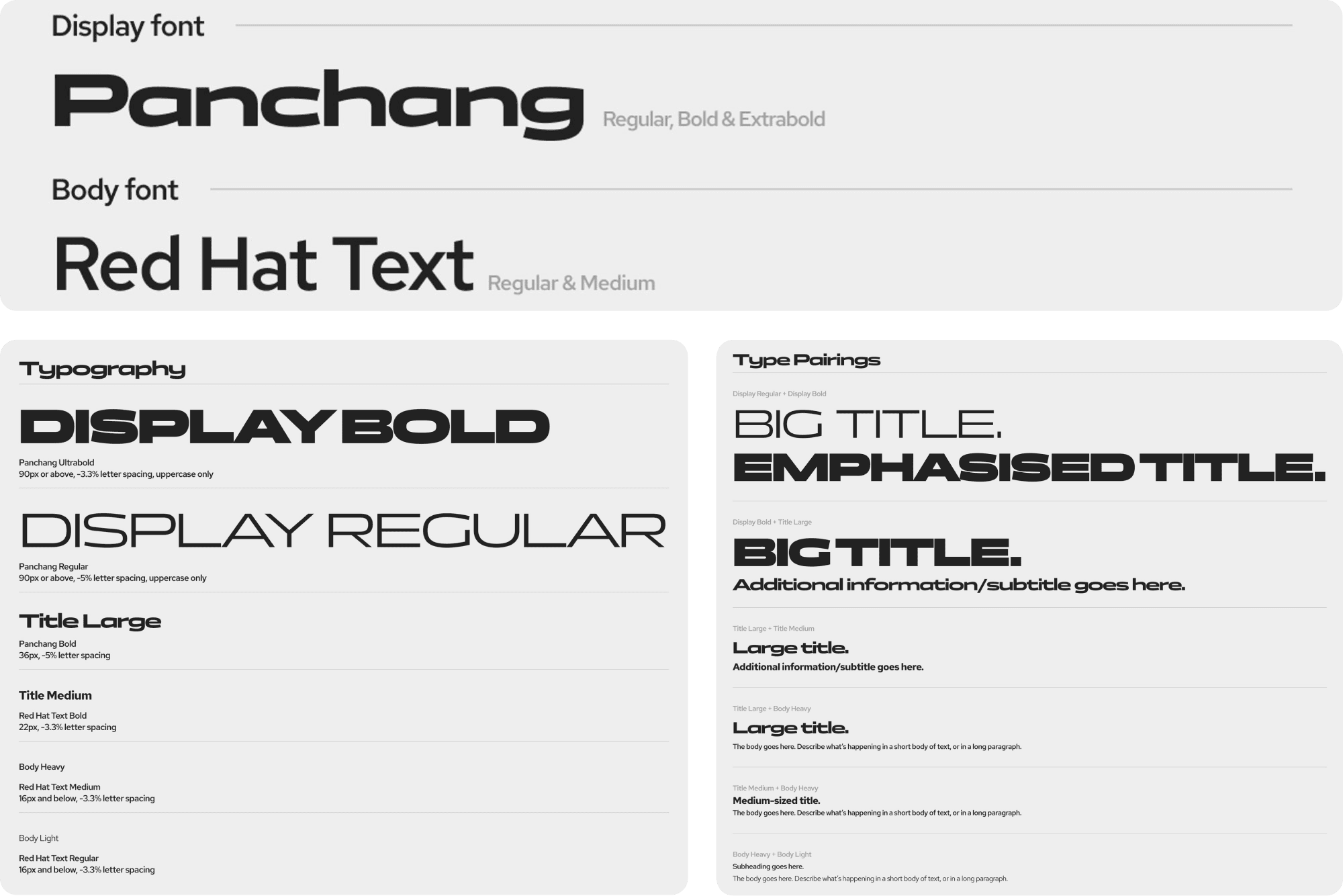
Defining a strong, neo typeface that conveys a strong sense of purpose and determination.

Depicting career growth and dynamism through vibrant yet contrasting colours.

The color palette for Abhay Mohan's brand is a deliberate selection that mirrors the essence of his motorsports persona.
'Fierce Red' leads as the primary color, capturing the passion and energy he brings to the track, while 'Dark Violet' provides a backdrop of sophistication, suggesting a depth to his racing strategy and presence. 'Electric Green' offers a vibrant contrast, symbolizing his rising career.

